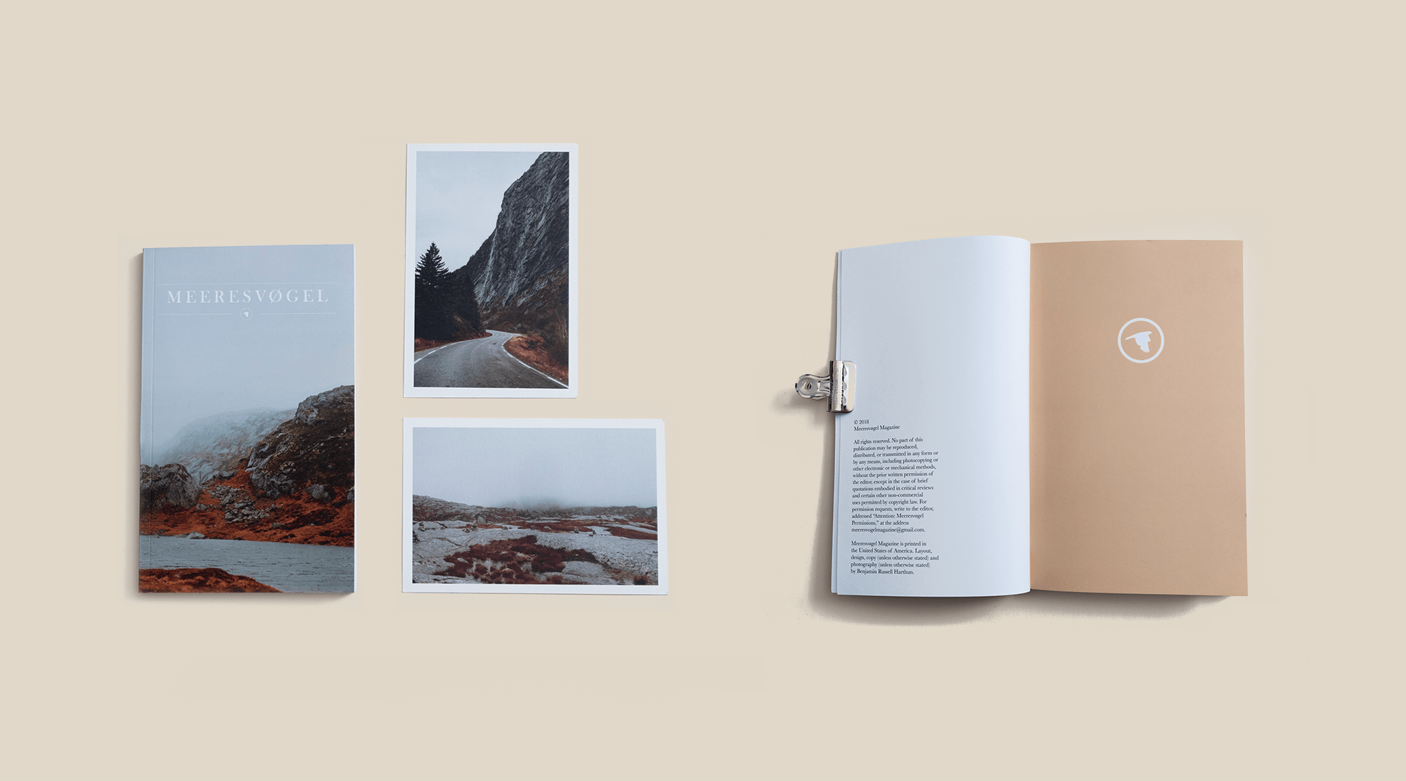
MEERESVØGEL
Duration: 2 years
Role: Creator, print, design, photo, editor
Contribution: annual, 80+ page non-profit pocketbook(s)
Target User: 18-35, artists, outdoor active
Non Profits: NAMI, Equality Now
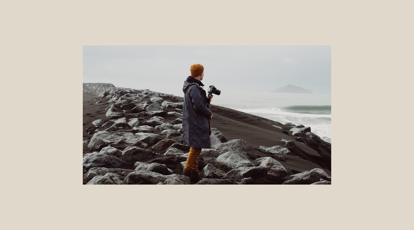
Meeresvøgel is a creative project with the goal of invoking hopefulness and inspiring others to be more creative, introspective, and active with their surroundings. We strive to help others reflect and to push through the darkness that creeps into the light of our daily lives, highlight perseverance, and feature the benefits of wondering as a positive experience. There’s more light in the surrounding of your life than you may think. Slow down. Breathe in. Notice life in everything. Meeresvøgel was originally created as a senior capstone project. While it’s evolved and transformed over the past couple of years, it’s above north star has remained the same. This is a look into the transformation of a digital magazine to an annual non-profit publication.
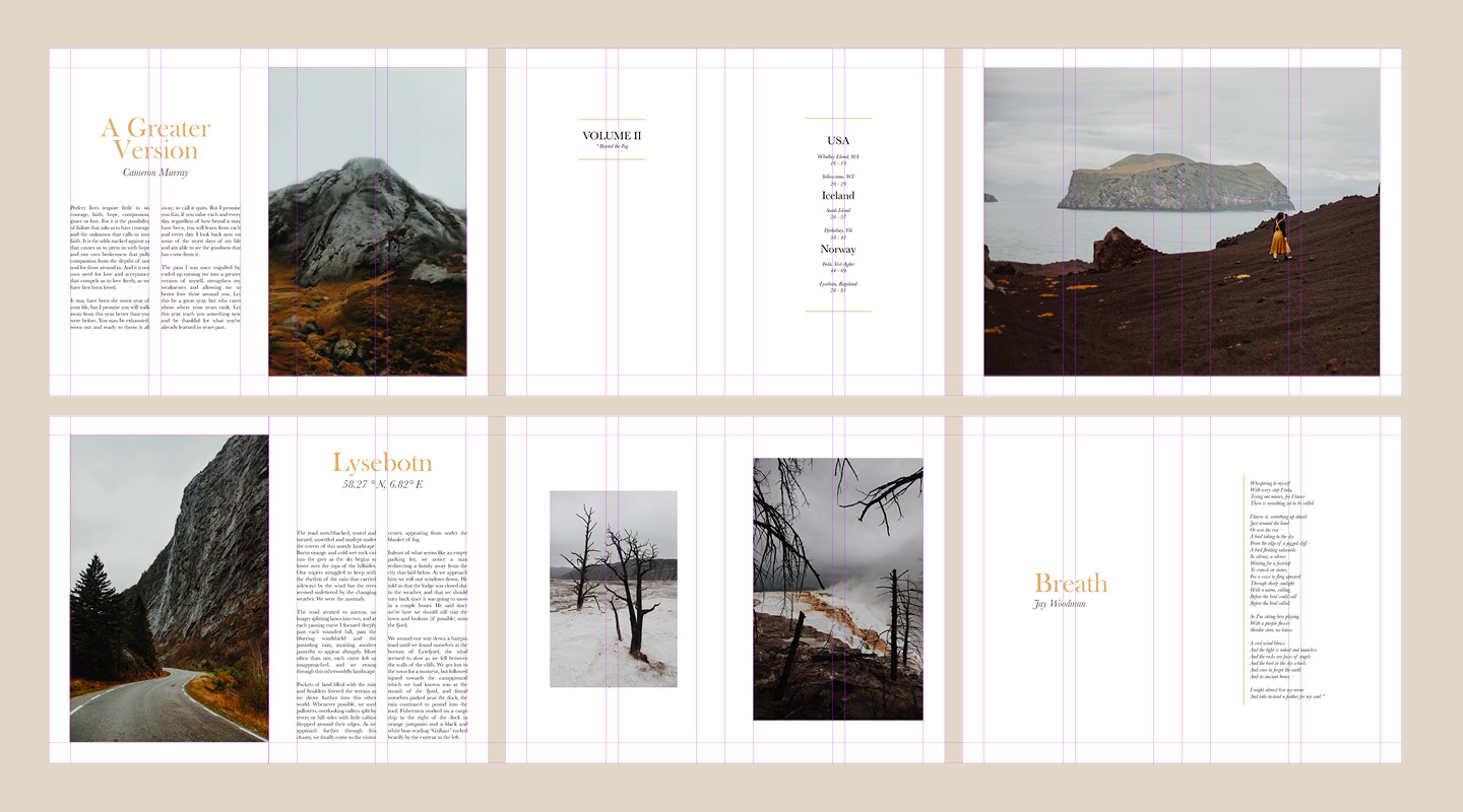
VOLUME II
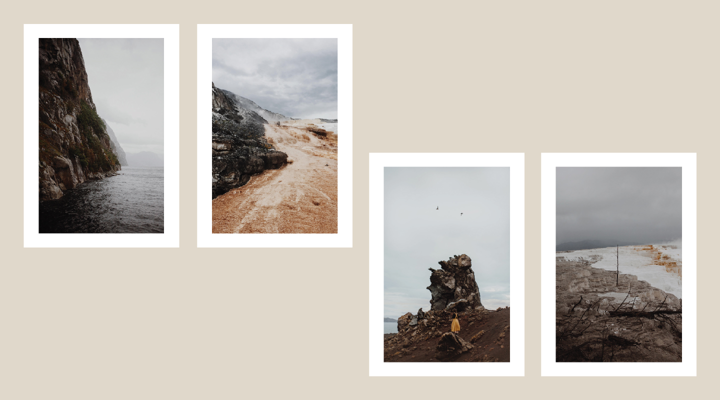
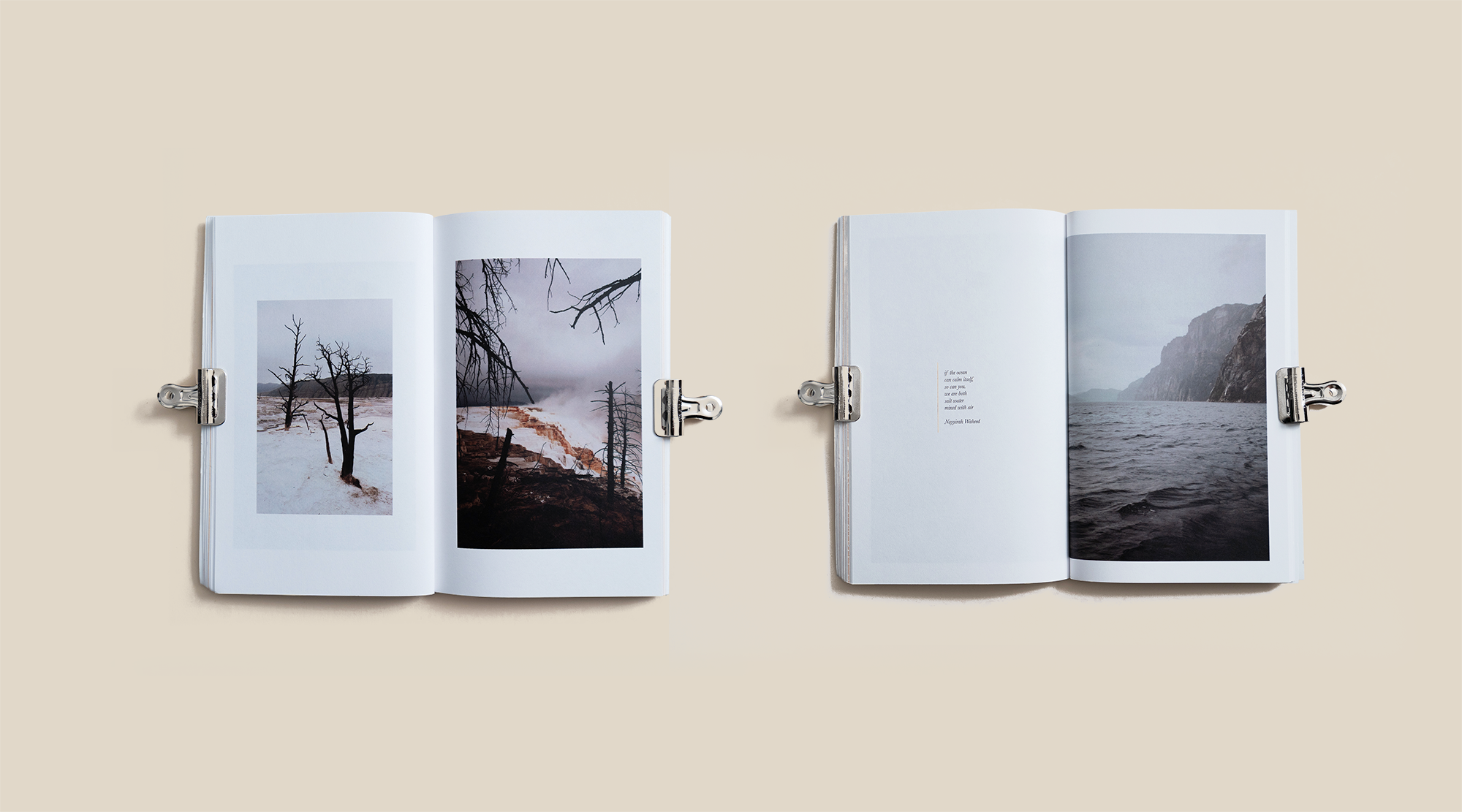
Over the years, we continued to explore this idea through places traveled, finding ways to push the design, the writing, and how it could possibly be digestible to a wider audience. Somewhere along the road, I decided to make the book a non-profit and would donate the net-profits from crowd-sourcing to a different nonprofit per issue. As a continued effort to push the topic of Mental Health towards ubiquity, we donated 100% of the net profits to The National Alliance on Mental Illness (NAMI). NAMI is the nation’s largest grassroots mental health organization dedicated to building better lives for the millions of Americans affected by mental illness. In 21 days we were able to sell about ~50 books, and donate over $500 to NAMI.
VOLUME III
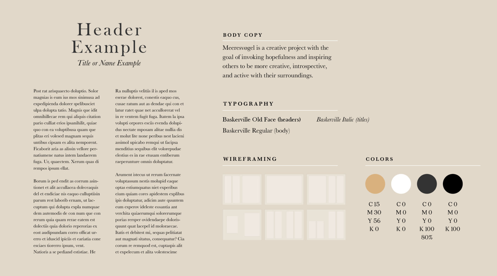
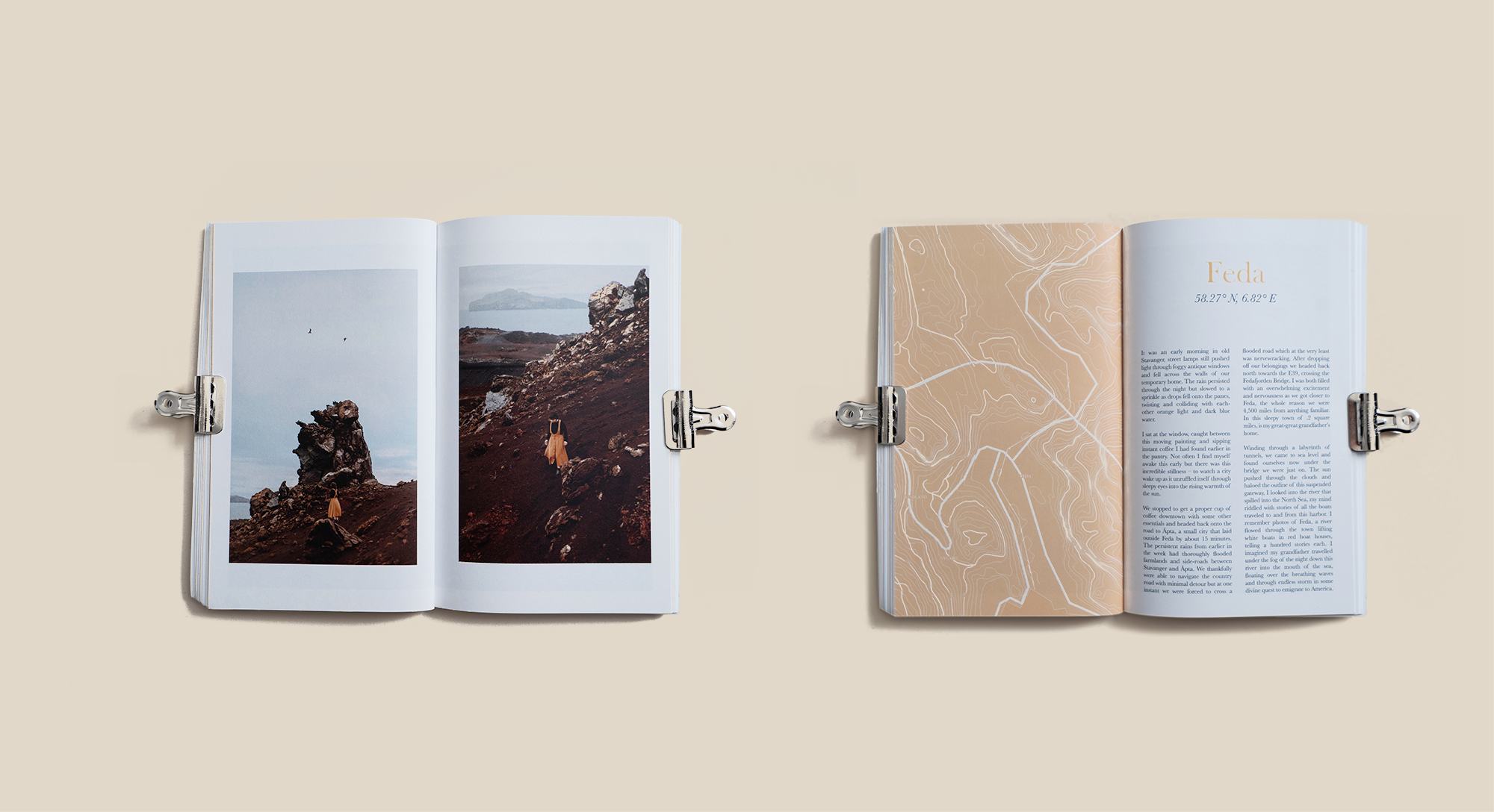
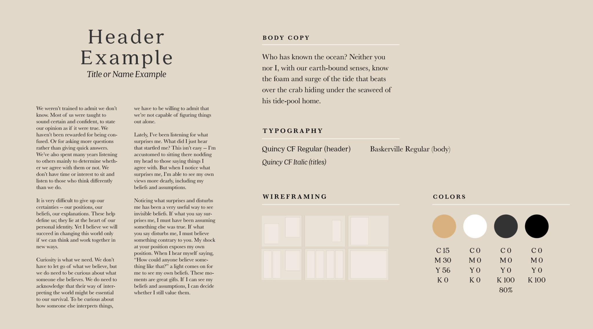
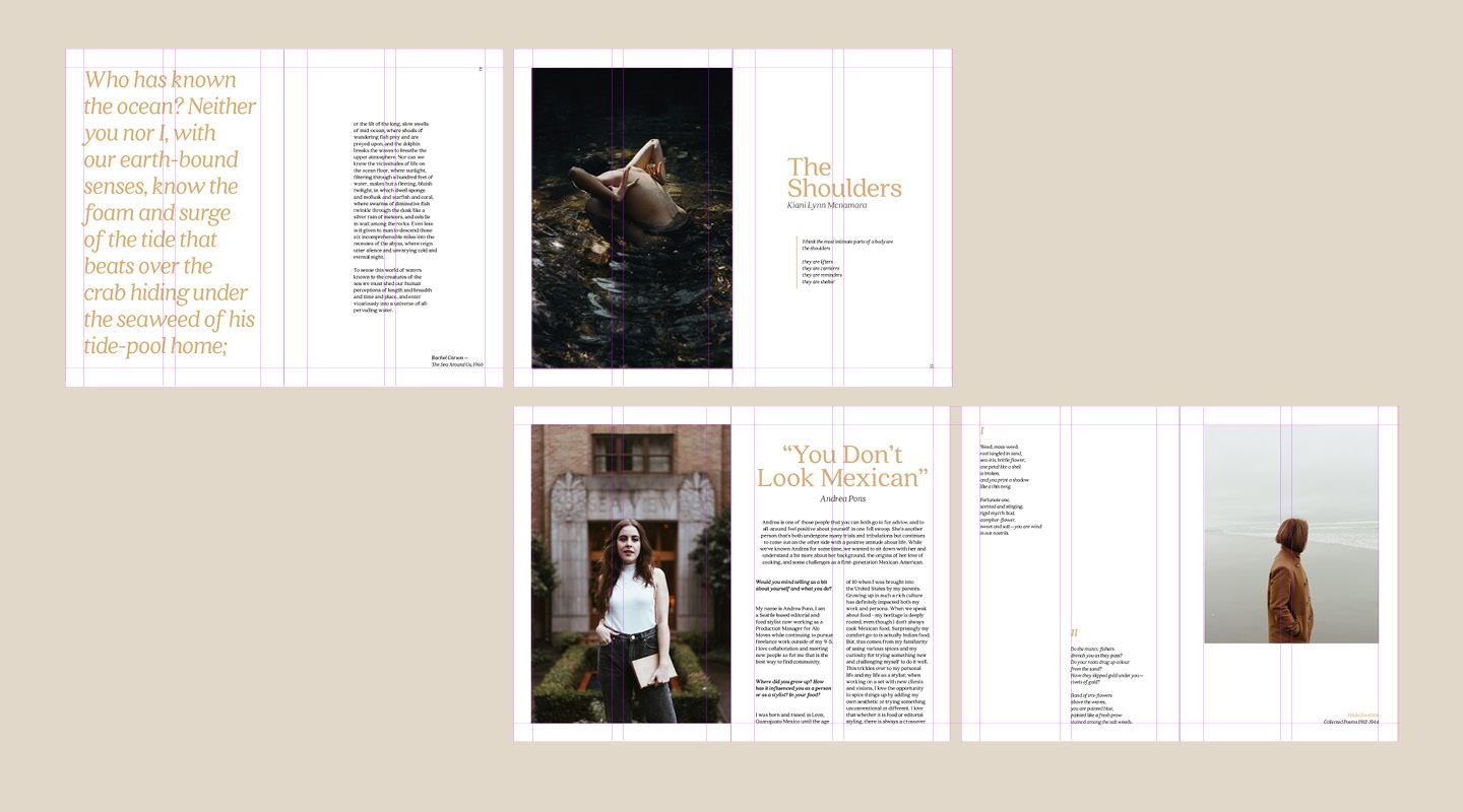
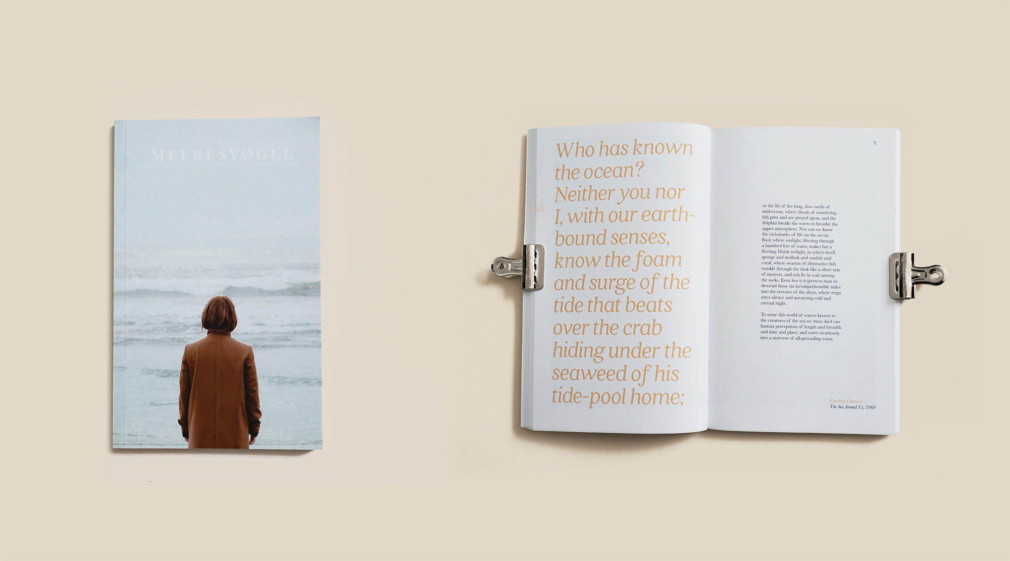
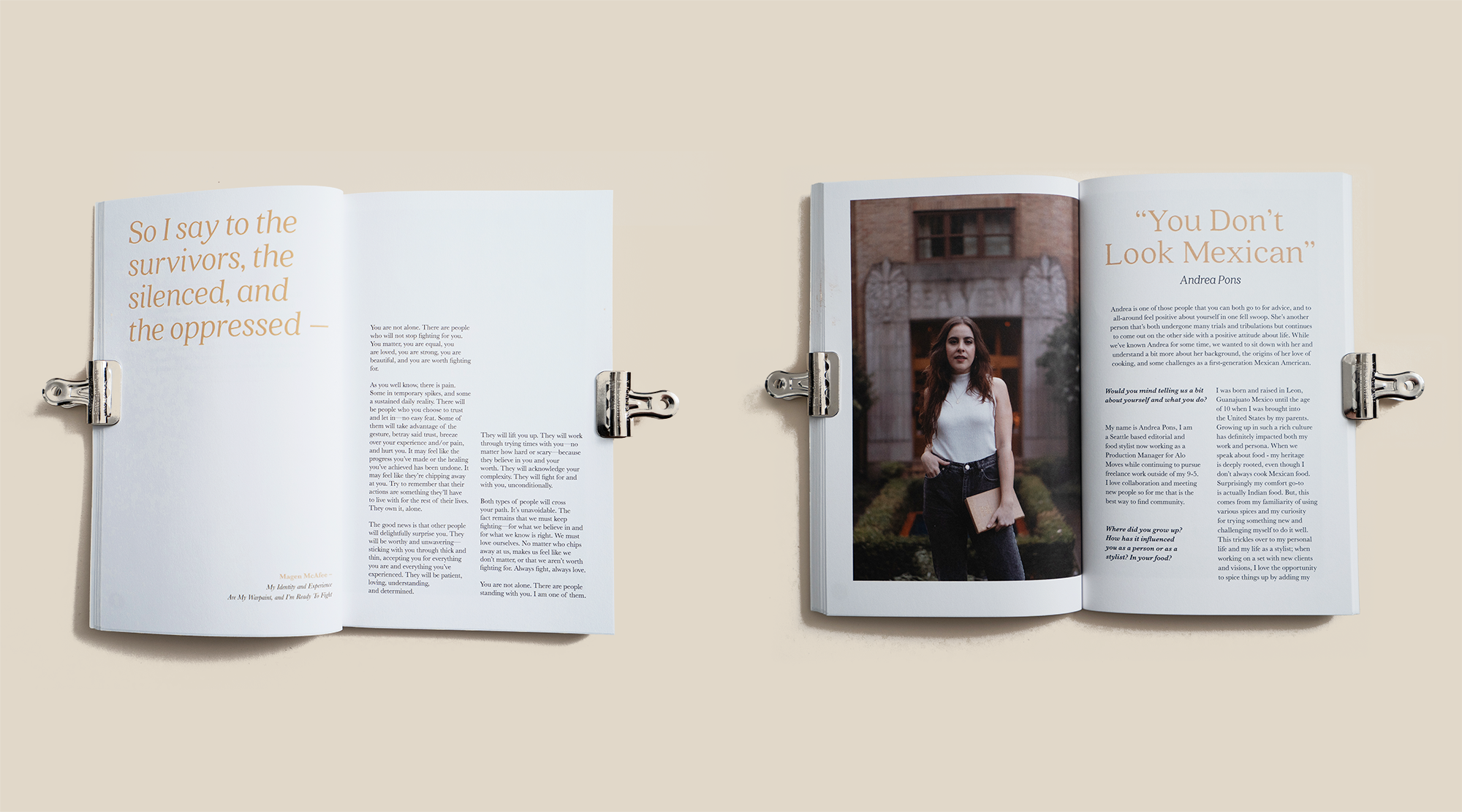
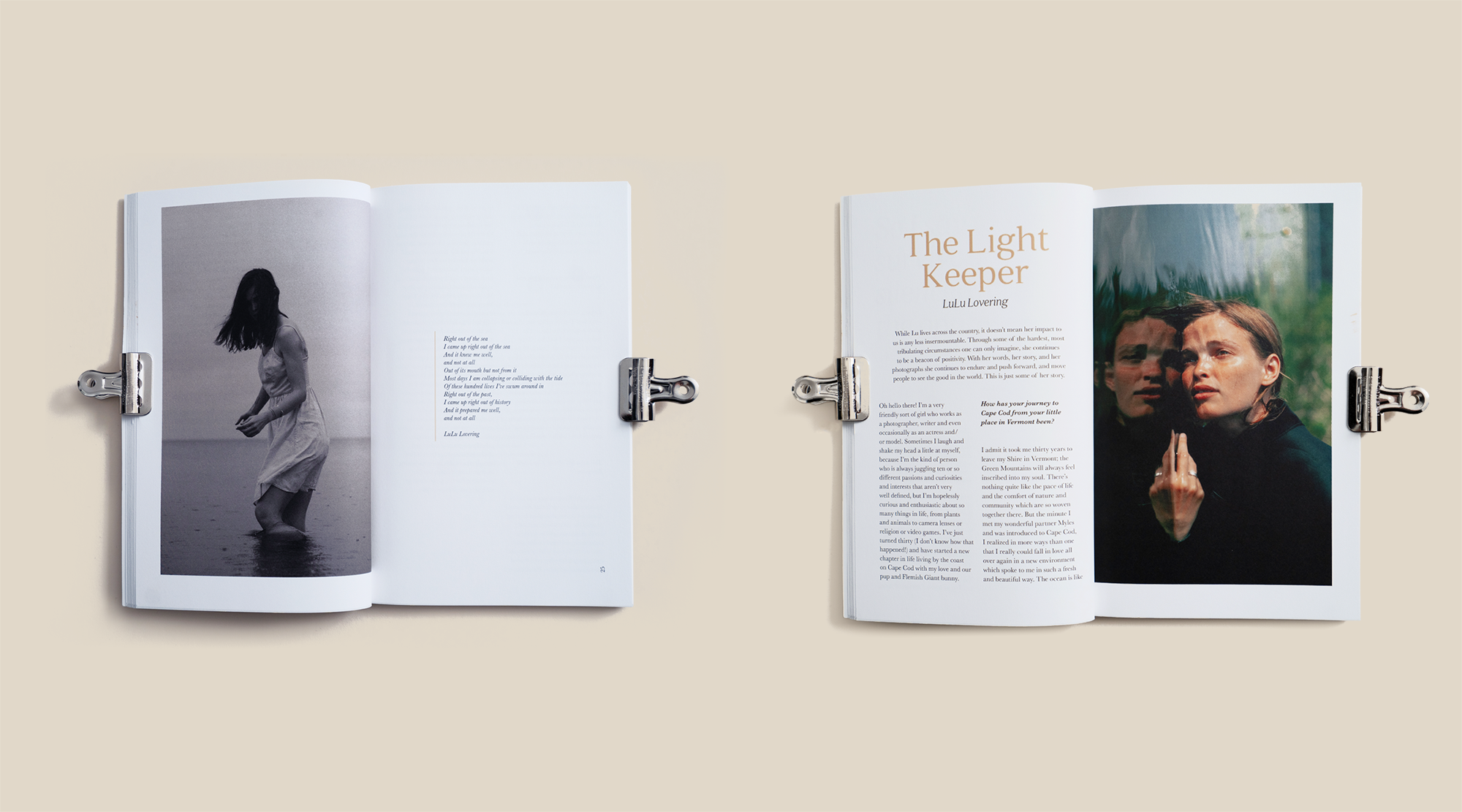
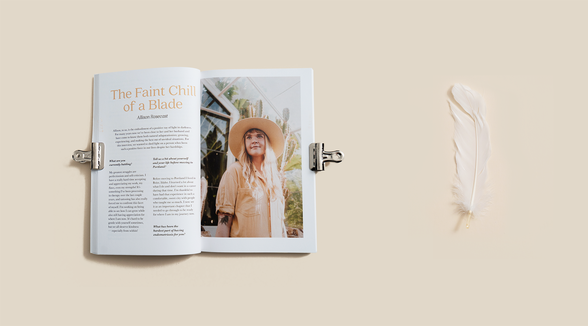
Volume III, while aligning to a lot of the visual style of volume II, explored various layouts and balance, uniquely tailored to each excerpt or interview. We wanted volume III to be more interactive and involved with the community and explored ways to photograph and interview people that inspired me. Type family for headers was updated from Baskerville to Quincy CF due to it’s unique stems and ascenders. The title remained set in Baskerville Old Face with manual kerning, body remained in Baskerville Regular.
VIDEO PROMOTIONS
Finally, as promotional material for the launch of the crowdfunding page, I shot and edited a 2-minute video to get people excited about the issue. Shot with Sony A7III, 50mm 1.8, 120fps/24fps, and edited in Premiere Pro.