WE.org
Role: brand designer
Contribution: brand book development, overall brand guidance
Duration: 6 months
Target User: we.org marketing
Client: we.org, Tether Digital
At Tether, a creative brand agency downtown Seattle, I worked directly under Creative Director John Kendall, heavily working on the brand guidelines for WE.org, developing design strategies, brand directions for events, and developing pitches for a partnership between Royal Bank of Canada and We.org.
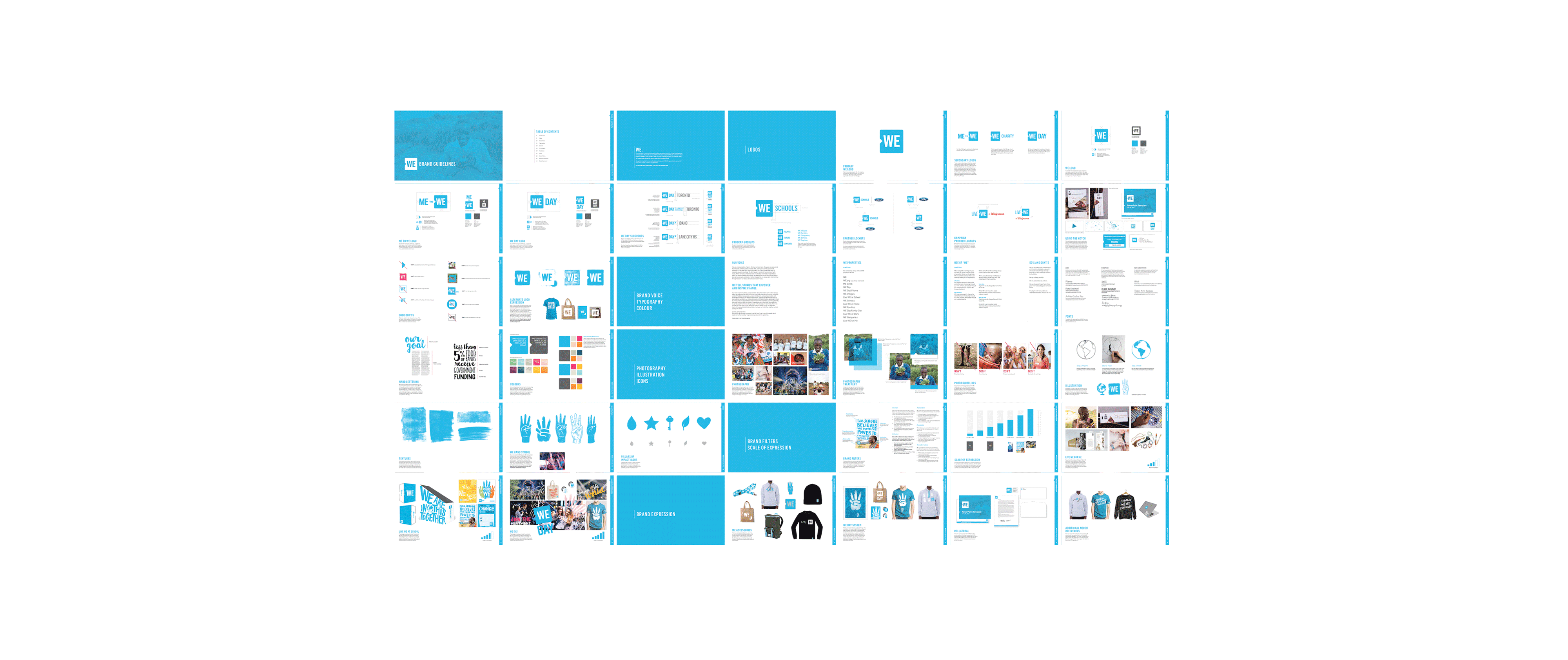
After listening to the needs of we.org and their marketing team, we began brainstorming on how and what the best practices would be to be easy-to-follow and help their marketing team better strategize and implement consistency to their overall brand. Distilling their needs into a comprehensive Table of Contents and working outwards became our approach.
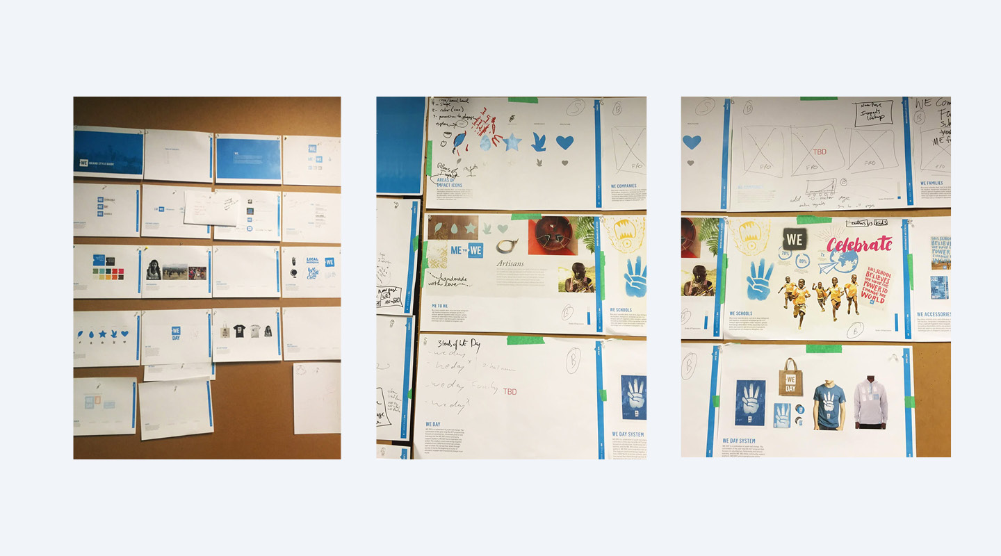
Wireframes
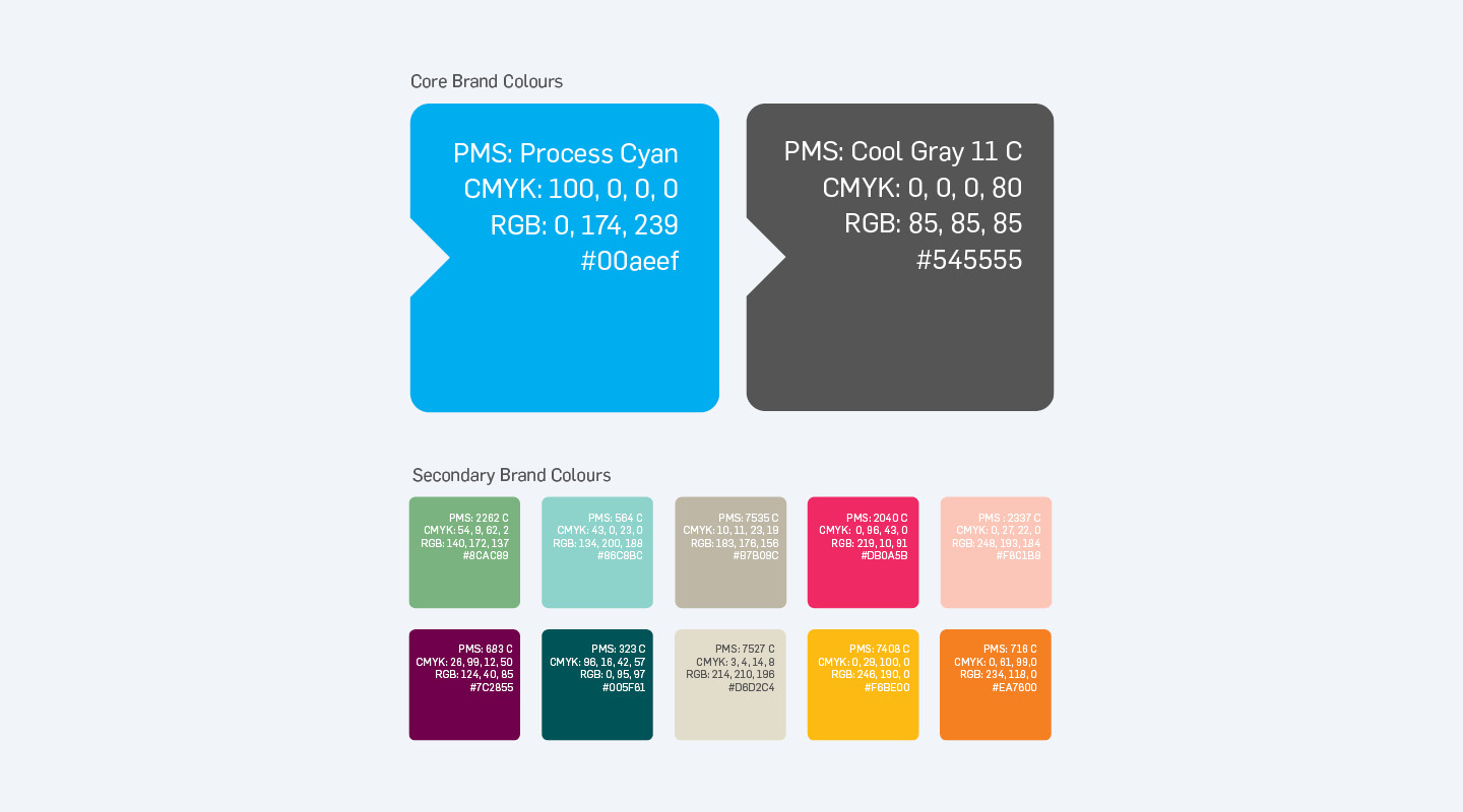
After the initial week of listening to we.org and their needs, we began wireframing and outlining the overall book into the following chapters: introduction, logos, brand/voice, typography, color, photography, illustration, icons, brand filters, scale of expression (where the brand should be more focused and professional to where the brand should be loud and expressive), and brand expression (how to use color and brand in print collateral).
Guidelines + Usecases
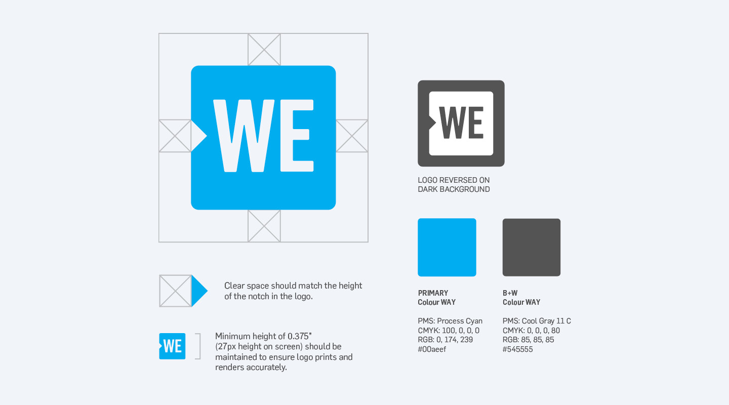
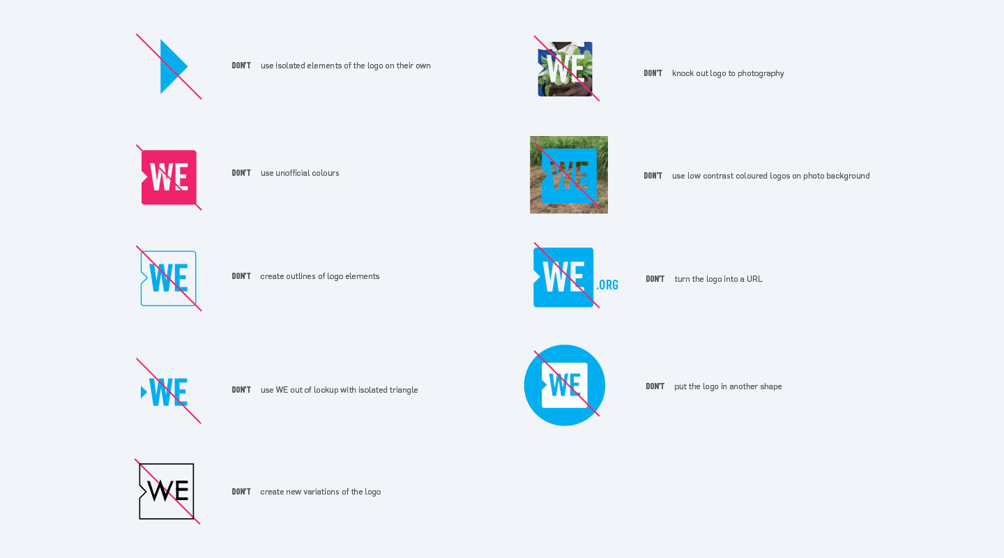
Once we began building out assets to include in the book, we began to quickly realize there were very few guidelines that were instilled and used by the marketing team. We reviewed various accessible brand books from companies like Nike to instill sort of “best practices” for how and when to (and not) use the logo as well as create best practices for how to create partner logos.
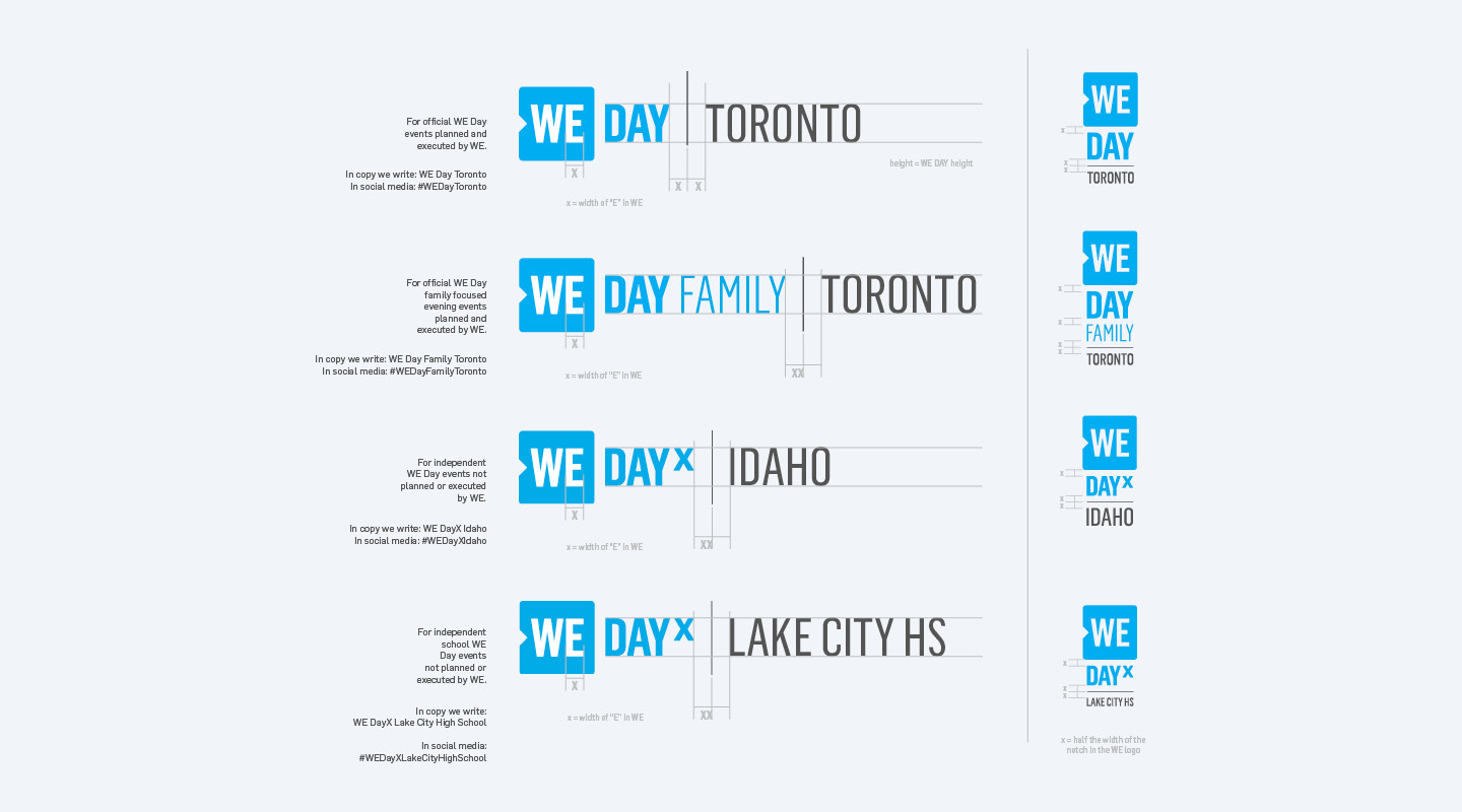
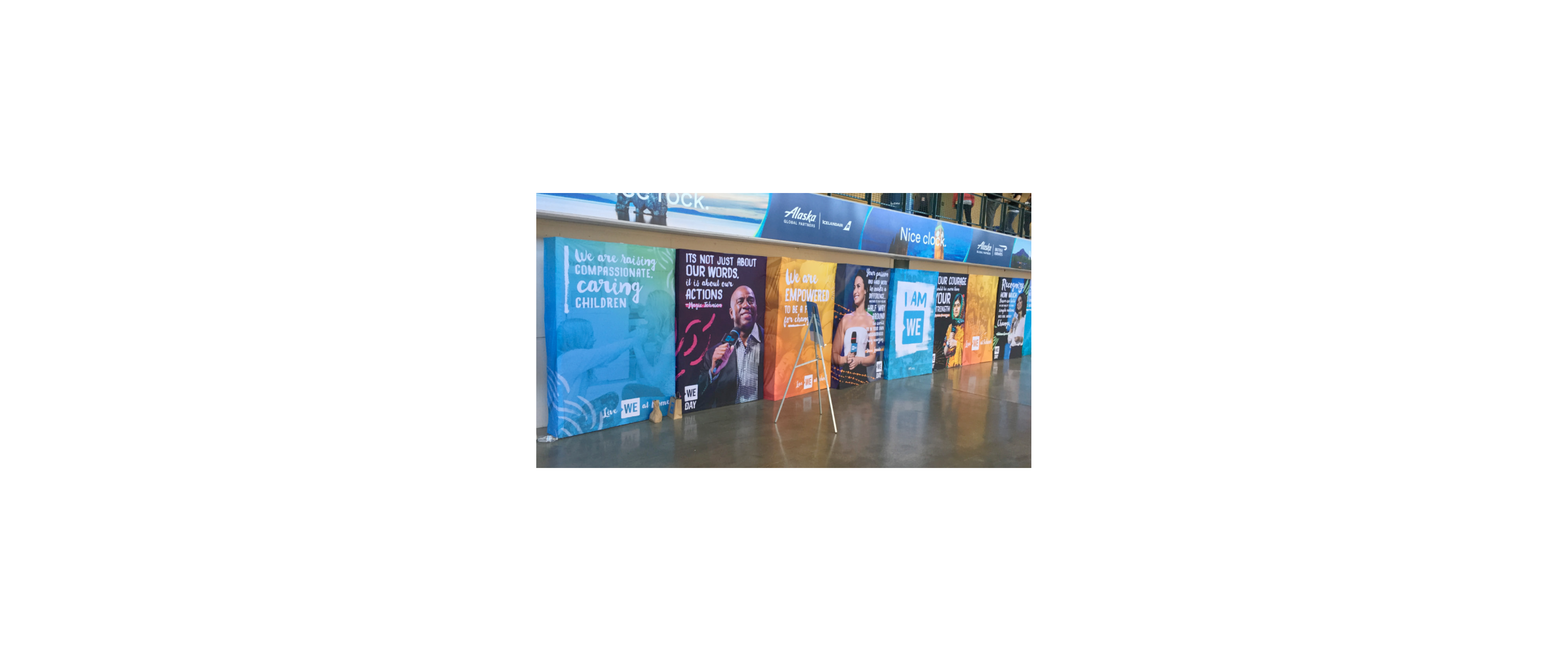
We Day
WE Day is an annual celebration of young people and educators who have made a difference. Held in over 15 cities across the United States, Canada, the UK and the Caribbean, the event series features world-renowned speakers, award-winning performers and real-world stories of change. Over 1-million youth have attended We Day to-date.
On a scale of expression, we.org and marketing categorized We Day an 11/10. I helped give guidance to their marketing team and we.org on how to tell their story consistently and having fun with color, type, and photography.


WE x RBC
Lastly, I had the chance to work on a pitch/rewards system that would give young adults different ways to give. The card would be similar to a re-loadable debit card, and each dollar spent would earn the user points to give to a village or town (IE gallons of water or building a well). This project we worked heavily with the copywriters to get the right messaging across and make sure the audience understands how they’re making an impact. Here I worked on how a campaign could look visually in different formats (digitally and in print) as well as concepts for the printed digital card. I also had the opportunity to envision/prototype the idea of how the rewards system could be integrated into an app.


MISSION STATEMENT
“The easier it is to make an impact, the more willing people are to do it. With a WE Impact Rewards Card, shoppers can make a difference without putting in extra time or money. Through everyday purchases made with their WE Impact Rewards card, they earn social impact points, which can be allocated to a cause they choose to help fund through the WE Impact app. Through this program, WE will empower shoppers to have the money they’re already spending converted into life-changing gifts that will empower communities around the world to lift themselves out of poverty.”


in it’s entirety here