AWS
AWS
Duration: 1.5 years
Role: on-site visual designer
Contribution: design systems, icon/illustration library,
brand support, event support, in-house swag
Target User: AWS users
Client: AWS, Filter Digital
As part of Amazon Web Services’ in-house design team, I was tasked with helping develop a more concise way of communicating complicated cloud computing products and services. The style originally known as “sketch”, was previously developed in a way to make cloud computing more approachable and fun, but it was unscalable, overcomplicated, and overcrowded page layouts. We wanted to approach illustrations to be read and understood quickly, was scalable (worked with an outside agency to develop brand guidelines), and kept pages cleaner.
HOMEPAGE
At Amazon Web Services (AWS), I worked directly with stakeholders and Principle Marketing Managers to meet design needs for net-new product launches. I also helped strategize with the small, onsite design team to redevelop brand systems to better communicate AWS’ products and services.
Below is a side-by-side comparison of the aws.amazon.com homepage. The hero backgrounds (orange) were reworked to be much bolder with color gradient meshes, and much more minimized graphic language. The editorial illustrations (4 graphic boxes below hero-nav) are a much quicker read while still keeping some playfulness in the visual language.
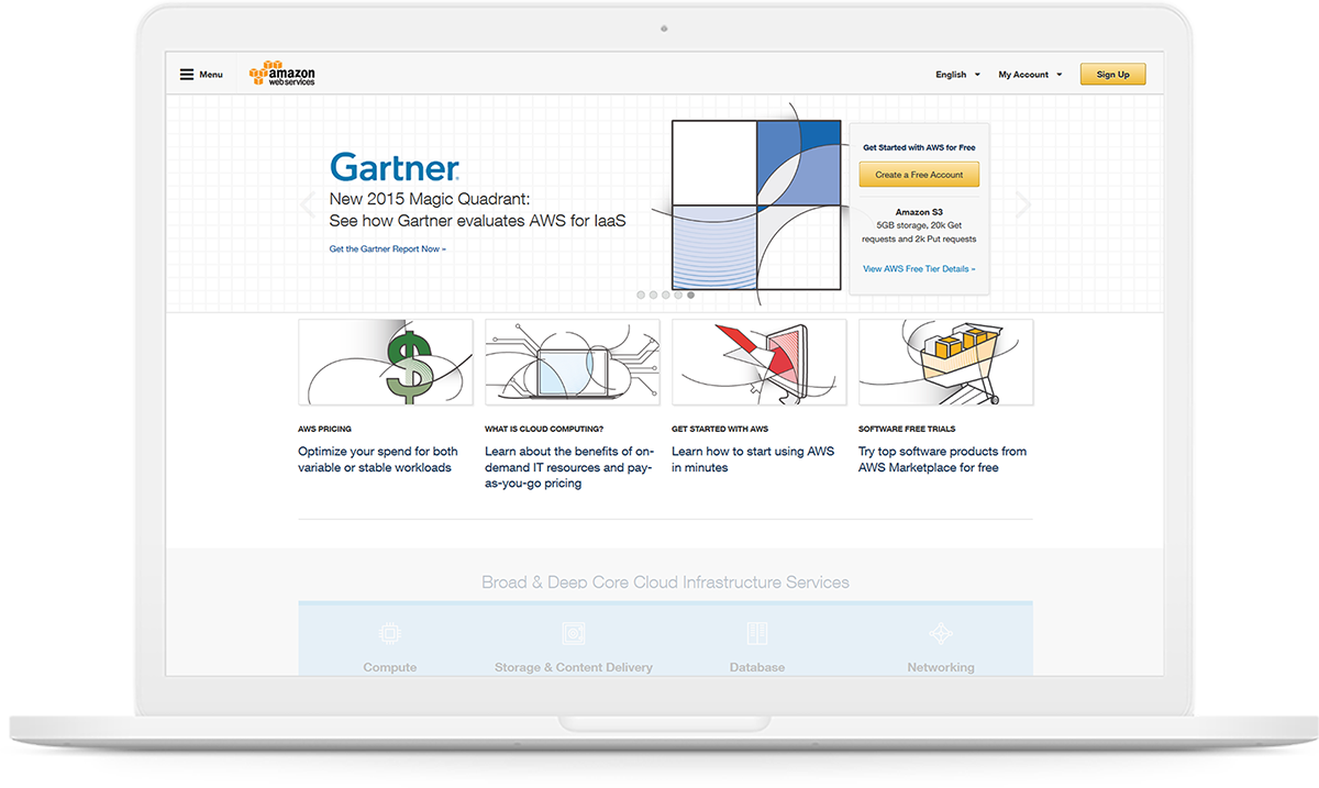
Ca. 2015, homepage had too much missused whitespace
and felt sterile yet chaotic. No real visual hierarchy.
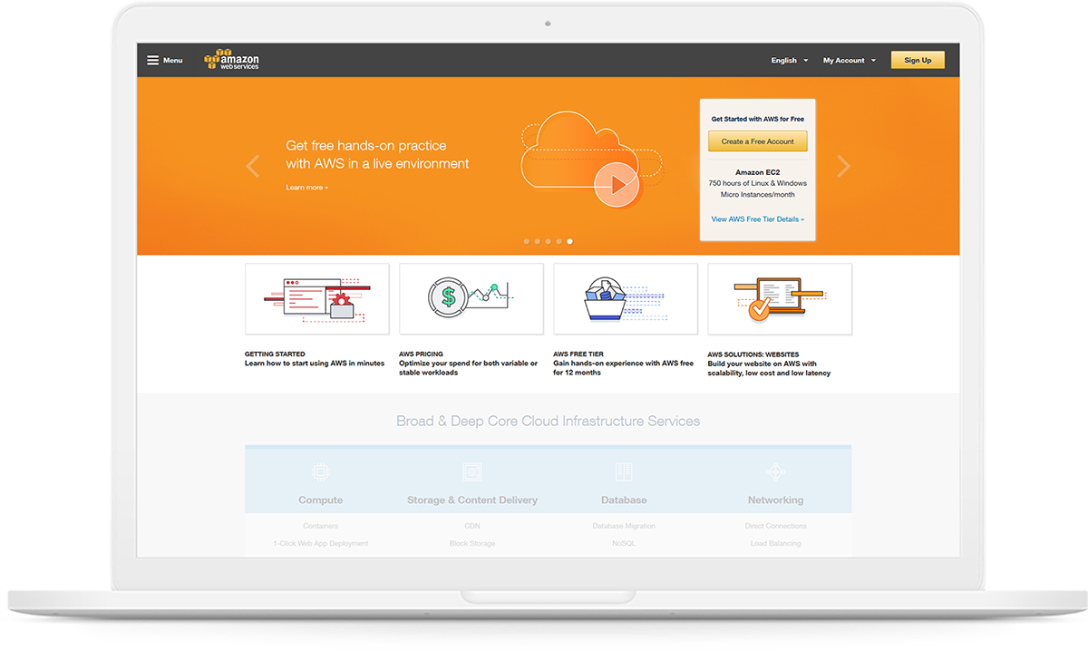
Ca. 2016, homepage has more intentional hierarchy.
Homepage banner is obvious first read, and editorial graphics much more discernible.
1. CREATIVE BRIEF
Navigating the world of business partners or Project Marketing Manager design needs, marketing objectives, and goals using SIM.
2. RESEARCH
Scour the web, read use-cases, research trends, and possible approaches. If further clarification needed, set up 1-on-1’s.
3. ITERATIONS
Develop 3-4 breadth of ideas to present to stakeholders that shows various approaches to their product needs.
4. DELIVERY
After final design approval, send deliverables outlined in design brief. If extra asks arise, communicate scope extensions.
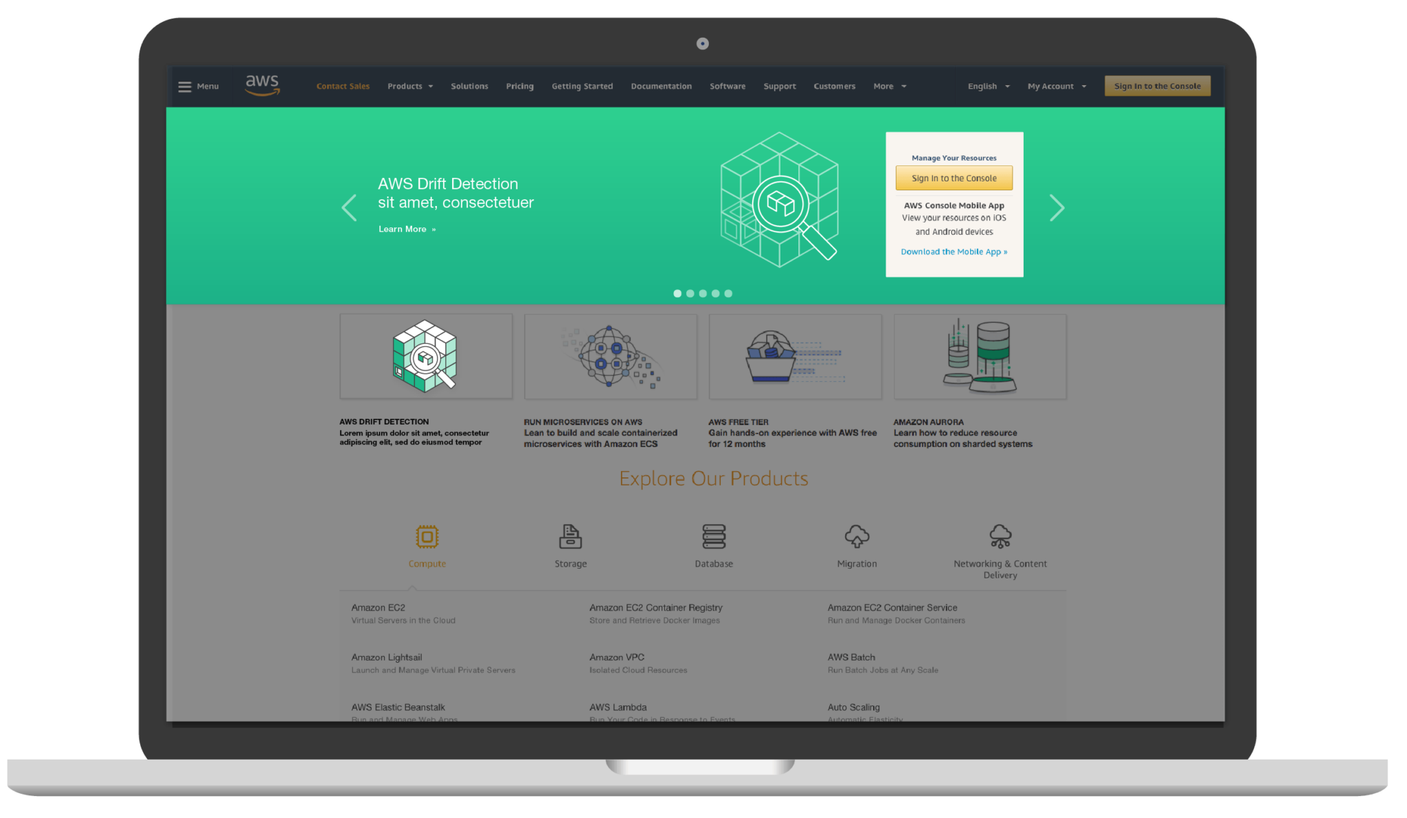
BUILD-OUTS
Design build-outs for a Tier-1 product launch including hero (aws homepage), social, email, and on-page graphics (editorial & 2up). We developed design systems so we could create scalable assets as quickly as aws was growing and to create visual cohesion as multiple designers worked on tackling multiple asks from stakeholders.
Line points, gradient meshes, colors, logo placements and graphic sizes were all designed strategically and added to the brand guidelines for reference or for outside agencies to help.

FEATURES
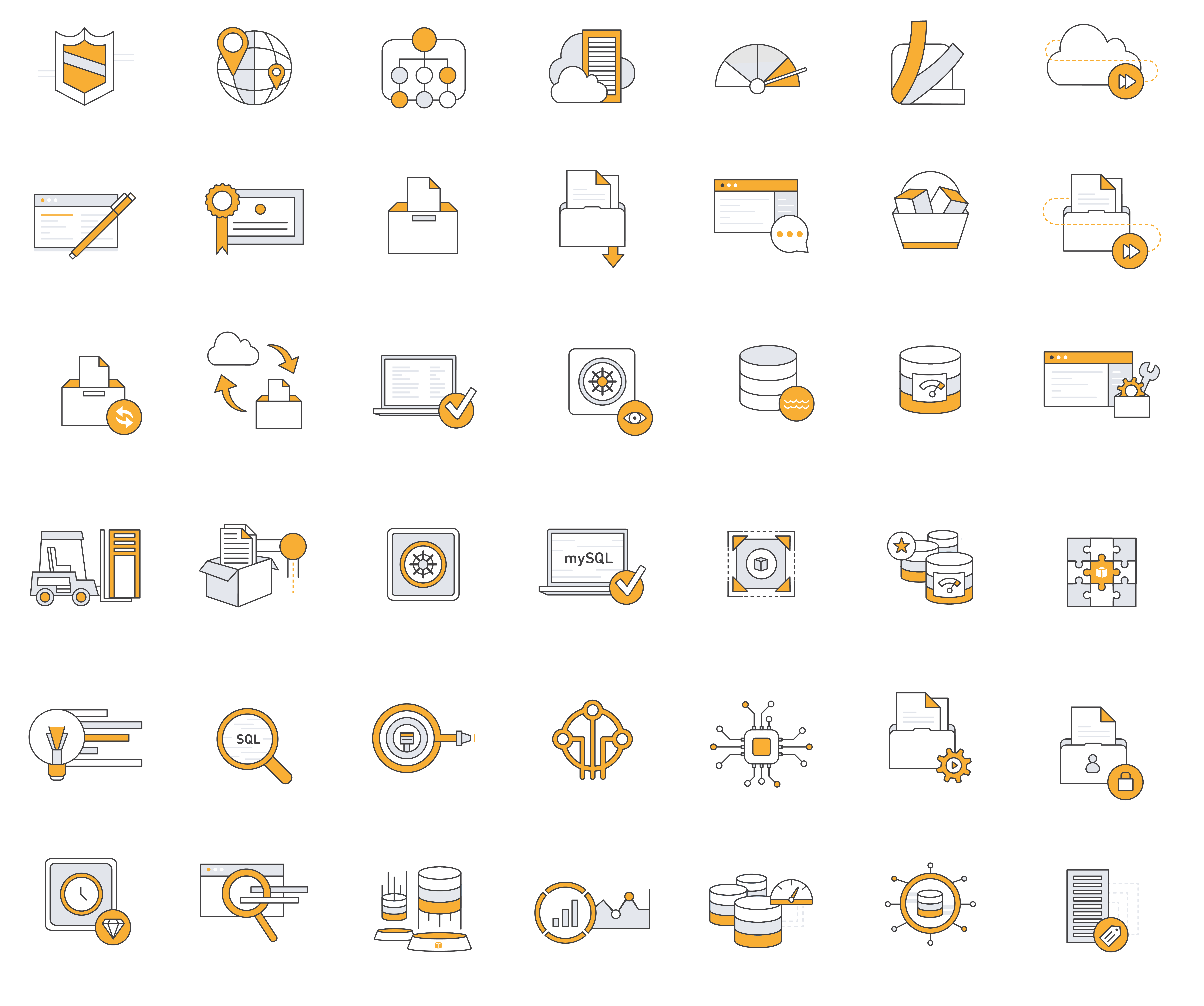
Features are illustrated concepts of products and services by using more objects and more variations. Below are some illustrations that I developed to communicate different features on product pages and were often a starting point for other designers on the team to work from to create illustration assets.
SWAG
Aside from my work in developing a new design language and transitioning an incredible amount of assets on existing web-pages, I was able to create some other fun, internal promotional items.
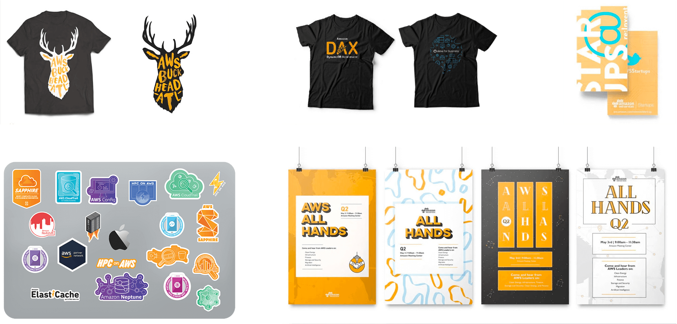
In conclusion, I had such an amazing time working with the design team at AWS developing brand strategy, learning to be a better illustrator, working with all the great Product and Project Managers, and developing swag. To see the case study developed by Filter Digital (my agency at the time as AWS’s sole design contractor), click here. To see some more work I did for AWS that deserved a whole separate page, click here.